Hi all,
Many were rather unhappy with the final paint job - or rather the color setting I had chosen.
Since I wasn't sure how far I would get with my "
Dragons Den" till the weekend I looked at miniatures to paint.
Since I thought I could (hopefully) do better this time, I took the
GOTHICA out of the display cabinet.
Since many recommended Isopropanol Alcohol best fro stripping paint, I gave her a thorough bath.
A horrible sight...
Unfortunately Isopropanol isn't as harmless as many said and while leaving the resin unfazed, I softened and partially destroyed the GreenStuff...
Many of you will remember, that much of the GOTHICA was GreenStuff...
Luckily I was able to fix everything before the PaintPal weekend.
Some new gems and new streamers
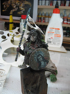
Since I didn't want to touch the freehand on the shield, I masked it before priming
After priming I added another spray of white to indicate the light situation I'm looking for
I think this light situation is better balanced
But still has some interesting views to offer
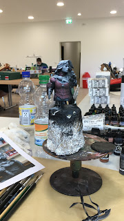
I arrived at the PaintPals Meeting location on Friday afternoon and we immediately began setting up. It was a nice group of 16 with plenty of space - I had a large table for myself - and after some friendly chit chat we began painting.
Since I really liked the leather look on the previous version I decided to go for a dark red leather armour again.
By now I'm really accustomed to my ScaleColor and the transitions went smooth and easy
Instead of the brownish cape I decided to use red this time
with relatively bright highlights.
Together with the shield it looks quite nice
Initially I planned blue gems as a contrast to the reds of the armour and cape
But after some feedback by Hansrainer, aka Apok, I recolored them in a dark green.
At the same time I started the face.
Vampiric is still the goal, so very pale skin to start with.
But shading almost white is really hard...
While the transitions were smooth and I avoided any "dirty" colors or a 5-o'clock shadow I was totally not pleased.
So on Sunday at noon - just before packing up - I decided to go for a totally different approach
Back home on Sunday afternoon I continued with her face.
Again the transition went rather well
With this dark skin the eyes really glow
Though the freehand on the shield is still displaying a very pale skinned vampire, I think this could work.
To get a bit of distance from the skin I played with the metal of her blade for a few hours
Last night had tropical temperatures and I couldn't sleep, so I spent half the night repainting her face again
Together with a first hair-job and the completed jewelry
I'm not 100% sure about the hair, but I do like the face now
So this is as far as got
What do you think?
Cheers
Klaus


